Landscape Architect, Bloom gold medal winner, and president of the Garden & Landscape Designers Association, Patricia Tyrrell shares her views and insights on Bloom’s 2016 show gardens
Bloom in the Park celebrated its 10th anniversary this year. Having launched during the boom years with some big budget gardens, it managed to survive the ‘make-do-and-mend’ period where the public learned to create gardens on a budget. There is a feeling in the air at the moment that things are getting better and it was definitely evident in the positive atmosphere at Bloom, not just because the sun came out to join the celebrations for the entire weekend.
A wonderful variety of quality gardens were on show, ranging from formal to natural, and from conceptual to very earthy. It was really impressive.
Bloom follows closely after the Chelsea Flower Show, the London Fashion Week of the gardening world. Some would hold the opinion that what we see on the catwalks and in the show gardens is not relevant to the ordinary person. However, designers look to these shows for new elements, materials and trends, ways of pushing the boundaries of design principles, exploring man’s relationship with the garden and giving us fresh perspectives on design. Over the years Irish designers have brought these ideas to Bloom: the cube garden house, coloured render, corten steel, still black pools, clipped box, meadow inspired perennial plantings, and many new varieties of plants and ways to include them in our gardens.
It is interesting to keep abreast of the trends, but in garden design it is also vital to be true to the place and your own vision. When you create a show garden you need to be true to the concept and completely immersed in what you are creating.
At Chelsea 2015 Dan Pearson recreated the slightly-gone-wild elements of Chatsworth Garden in Derbyshire. It was a beautifully atmospheric space which evoked joy and nostalgia in equal measure. For me, this was an example of everything a show garden should be: original and completely true to the concept, not influenced by fashion, the litmus by which others might be judged.
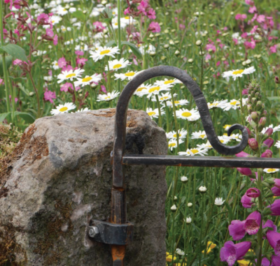
There was one such garden at Bloom. Barry Kavanagh’s ‘Across Boundaries’ garden won the People’s Favourite and the Designers Favourite awards. Designed to demonstrate the positive effects of farming on the lives and health of people in the health and social care services, it also had positive effects on those who viewed it. It was lovely to just stand and look, absorbing the bigger picture and all the small and perfect details that gave it atmosphere and interest. I loved the kissing gate and the traditional field gate, both once an integral part of the Irish rural landscape, where each locality had a variation depending on the style of the local blacksmith. The whole garden was enclosed in a mossy, ferny wall of local Irish stone complete with a stile. It felt like a real place, with a timeless quality. The planting consisted of mostly native species. Juncus effusus (such a wonderful accent plant) was used to great effect to frame and control your visual exploration of the scene. Bright and beautiful patches of Lychnis and Leucanthemum greeted you at the gate – it was just magic! The species-rich meadow brought back childhood memories of picking cowslips in small fields. There were other references to the past in the remains of farm equipment, a milk churn and an abandoned cartwheel against the corrugated iron shed. The scale and proportion of the spaces and elements were created with an artist’s eye.
The award for best concept garden went to UCD’s ‘Evolution of Land Plants’ garden, another example of a garden where shared passions and a strong concept made for a memorable and atmospheric space. The planting was beautifully carried out and the repetition of the ecological niches, with an ever-expanding variety of plants, gave the whole a dynamic feel. A wonderful opportunity for Bloom too, to have a garden that was so educational. The garden seemed to literally buzz with interest. I also loved the corten laser cut panels which were cleverly reflected in the pools and added so much atmosphere to the space.
Best in the show and the overall best large garden category awards went to Alan Rudden for his ‘Santa Rita Living La Vida 120’ garden, a celebration of the rich history, culture and heritage of the Santa Rita vineyards, winery and park in Chile. It had a wonderful Mediterranean feel, strongly redolent of holidays spent in warmer climes, the sun over the weekend playing a supporting role. Beautifully finished, I loved the proportion of the spaces and particularly the indoor/outdoor feel of the dining area. The Acacia trees placed in this area were a particularly nice touch.
The planting at the front was a nice homage to James van Sweden’s drought tolerant planting at Sonoma, California, consisting of olive trees, Agave and Nassella tenuissima,
particularly beautiful when they caught the evening light. The planting was mostly Mediterranean – olives, rosemary, thyme and citrus. There was a missed opportunity here to employ more Chilean plants in the garden, to transform it from a villa anywhere in the Mediterranean world to a distinctively Chilean garden. The vineyard connection was also quite weak with just a small group of vines at one end that looked unresolved in their location.
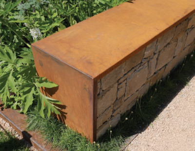
Another gold medal-winning garden in the large garden category was Andrew Christopher Dunne’s ‘Face to Face’ Savills garden. Its aim was to reconnect us with our environment and with each other. Brave and bold in scale, with a very large rectangular dark pool of still water, the predominant materials corten steel and a long granite wall, also bound gabion-like in steel. The chief qualities of corten steel are its monolithic appearance, fine texture and warm rusty orange/brown tones. Though the planting had been carried out faultlessly, the choice of fine-textured woodland style planting lacked depth and tended to flatten the scene. The overall pale colour scheme also failed to make the garden sing. Big and bold was needed here, to ground the garden and give it depth. Lots of of textured greens, deep coppery tones and some warm echoes of the rusty steel colours would have worked well.
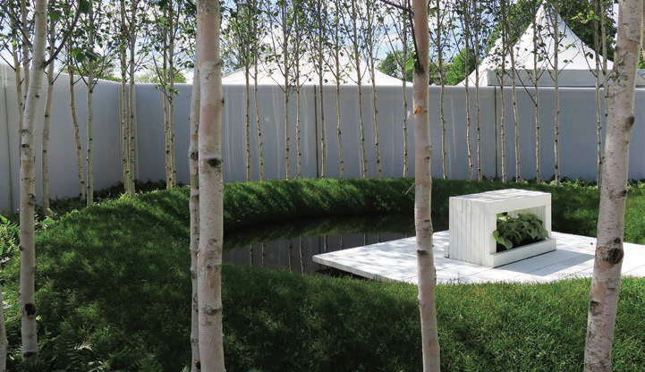
Feelings of serenity and connectedness were shared themes through many of the gardens. The challenge in this is producing a strong and memorable space from a very broad concept or ideal. Hugh Ryan achieved this through symbolism and a minimalist approach which created a memorable space that could easily be incorporated into a bigger garden or park. Fiann Ó Nualláin’s ‘Tao of Now’ reducing stress and healing garden, also achieved his concept through simple but strong symbolism. The seat was a hand held out, which simultaneously combined a feeling of movement and calm.
Mental health was also to the fore in Padraic Woods’s ‘Sharing the Load’ garden, with the strong concept of a seesaw and a tunnel, representing the emotional seesaw that is part of depression and mental health issues. Sponsored by St John of God Hospital, Stillorgan, the garden is to be reconstructed there. It will be interesting to see this garden on a bigger scale and site where it will have a greater impact.
There was a particular focus on planting this year by the Bloom judges, as this was an area identified as being weak in previous years, with potentially a prize for the best planting in 2016. Historically, Irish designers seem disinclined to take planting seriously and rather than design their garden holistically with a focus on both the hard and soft elements, the planting tends to become an afterthought.
The prize for best planting and the best overall winner in the medium garden category went to James Purdy for his ‘Podscape Garden’, a beautiful tapestry of Deschampsia, Briza, Geum, Mellica, and Orlaya. James’ garden used a ‘matrix’ style planting, which repeats a desirable pattern. A different matrix was used at the back in the shadier areas, where ferns and foxgloves were used. From a distance, it looked stunning, the colours of red and white working really well with the deconstructed black cube, though close up the constant repetition left little for the eye to rest upon.
The colour combination and the airy feel of the grasses were lovely, but the ‘look’ would not have lasted more than a week or two as the Geum and Deschampsia started to bulk out. I think too the Mediterranean annual Orlaya, which loves to seed itself in the gritty arid soil around olive groves and vineyards, might not have liked hanging out for too long with the Geum and Deschampsia, both of which need moist rich soil to grow well.
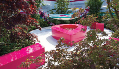
There were lovely colour schemes in the planting in Tünde Szentesi’s ‘Garden of Hope’. These were hard to appreciate though, as an invasion of bright pink elements distracted from the detail. The sponsors should really allow the designers to convey the message of the garden rather than have too much of their own material and symbolism present.
Liat and Oliver Schurmann of Mount Venus Nurseries had two gold winning entries in the small garden category, both demonstrating the Schurmann’s breadth of design skills.
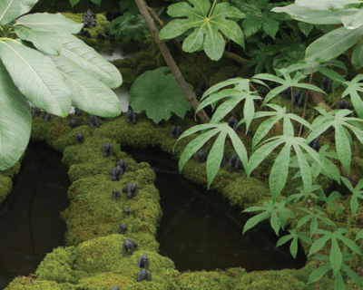
The Tarzan garden was a perfect example of what can be done to create atmosphere and depth with plants alone. Rhododendron, Aralias, Schefflera, Astilboides tabularis and ferns, to name but a few, combined in texture and shades of green to give the impression of looking deep into a jungle from above. Some mossy timber, some tiny gorillas and a little dry ice and water and an occasional appearance by Tarzan himself made the space truly theatrical.
The Schurmanns other small garden ‘The Designers Backyard’ was a study in elegant detail. New planting combinations and gems could be discovered by looking through the various openings and windows into the garden. In addition to gold, it won the best overall small garden award.
Planting was also to the fore in the garden for Our Lady’s Children’s Hospital Crumlin, designed by Kieran Dunne and Anthony Ryan and sponsored by Kildare Growers. So many beautiful specimens were here and it was refreshing to see more trees and shrubs used in the design. Unfortunately, it had a very overplanted feel. It was hard to appreciate the beauty of individual specimen plants properly.
There was a tendency amongst all the gardens to put specimen trees to the back or sides or swamp them with uncomplimentary planting which negates the whole purpose of a specimen, which is to show off and be celebrated. There also seems to be a fear of framing, by placing trees or specimens to the front where they control and give depth to the views into the garden.
Why are designers still enthralled with birch, as if it were the only suitable small tree available?
Perhaps Bloom organisers should consider banning it for a year – just for fun! There are so many plants and planting combinations to choose from. The scope for creativity is endless and yet the same plants and combinations come up year after year. I don’t think that the nurseries can really be entirely blamed for lack of variety as most plants can be sourced with a little early planning.
It was good to see an increased use of sculpture in the show gardens but in a similar vein to the planting, they tend to be an afterthought, rather than being given the careful placing they require. In the ‘Sculpture in the Parkland’ garden by Ingrid Swan and Ruth Liddle, there were so many covetable pieces that they spilled out into the surrounding area without a garden to cherish them. There were some lovely pieces here and elegantly designed seating that one could have designed a whole garden around.
The trend towards more local materials is an encouraging one. I have long felt the use of stone brought from halfway around the world to be not only very unsustainable but aesthetically jarring on the eye, as it generally doesn’t fit in with our mild and misty island. Local granite and Valentia stone and Cavan sandstone were an encouraging sign for future Blooms. Also encouraging were the seeds of a more Irish design style, sown by Barry Kavanagh. We can look elsewhere for ideas, but inspiration should come from within ourselves. ✽
 Patricia Tyrrell, is a landscape architect, garden designer, horticulturist and gold medal winner. She can be contacted via her website at www.living-landscapes.com Patricia Tyrrell, is a landscape architect, garden designer, horticulturist and gold medal winner. She can be contacted via her website at www.living-landscapes.com |


